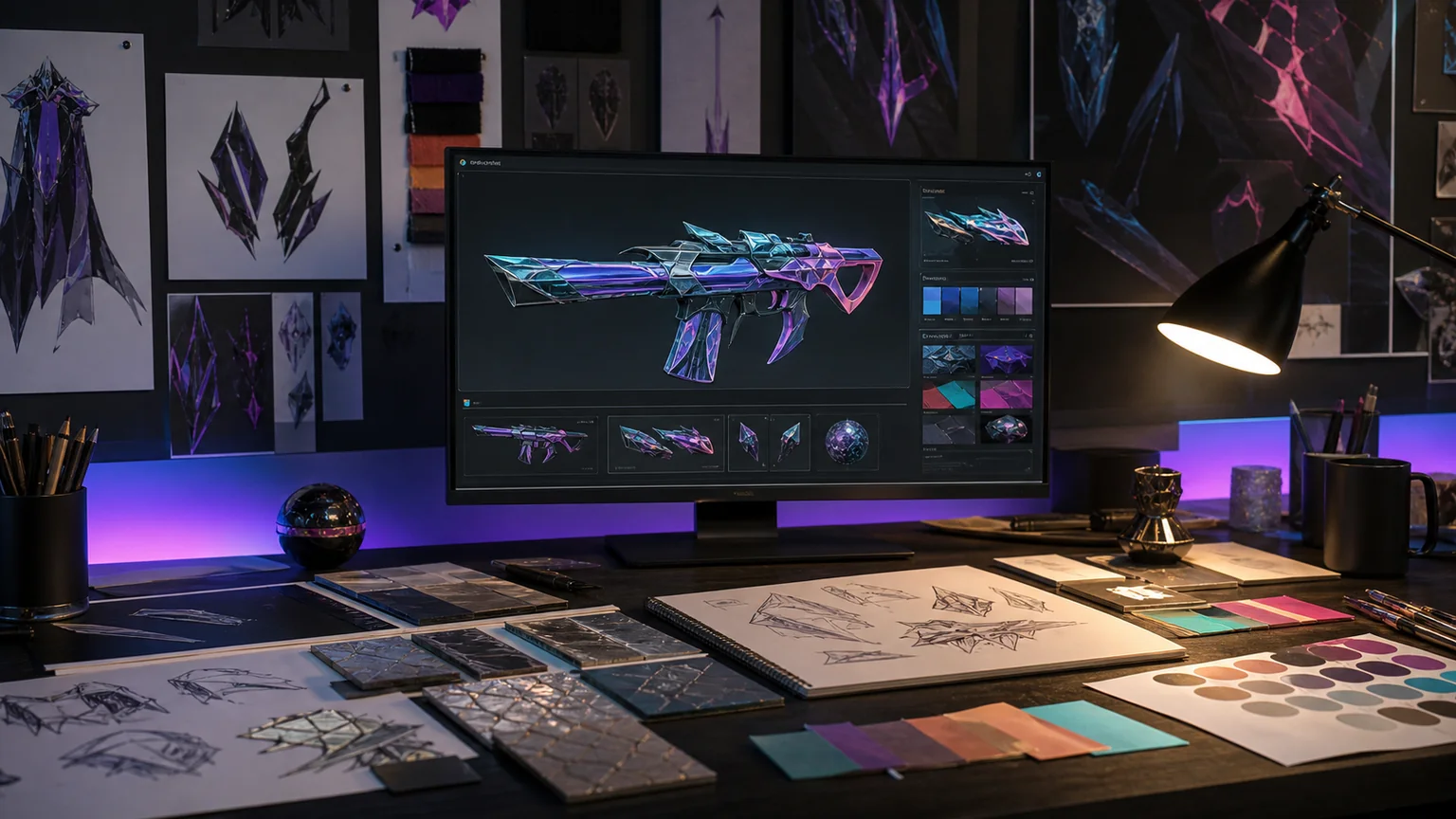
Cosmetic preview lighting should reveal, not advertise
A trustworthy skin preview uses neutral, bright and gameplay-like lighting so players can understand material and color before selection.

Visual culture editor
London · Design desk
Aya covers game cosmetics as designed objects rather than price charts. Her criticism looks at first-person readability, animation language, material separation and the way sound changes a cosmetic through repetition. She also reports on the production process behind collections and the community culture that grows around them.
Complete archive
A trustworthy skin preview uses neutral, bright and gameplay-like lighting so players can understand material and color before selection.
Spectacle is easy; keeping a hero readable during a crowded fight is the harder design test.
After years of visual noise, cosmetic teams are making readability fashionable again.
A design-team workflow for concept selection, first-person readability and final polish.

Privacy controls
We use essential storage to remember your choice. Analytics cookies and full measurement remain disabled unless you allow them. Read the Cookie Policy.
Consent centre
Necessary storage supports security and remembers this choice. Google Analytics is not loaded and no analytics data is sent until you explicitly allow it.
WordPress security, editor sessions and your consent preference.
See cookie names, purposes and retention periods