Cosmetic preview lighting should reveal, not advertise
The showroom can be dramatic only after it answers how the object actually looks.

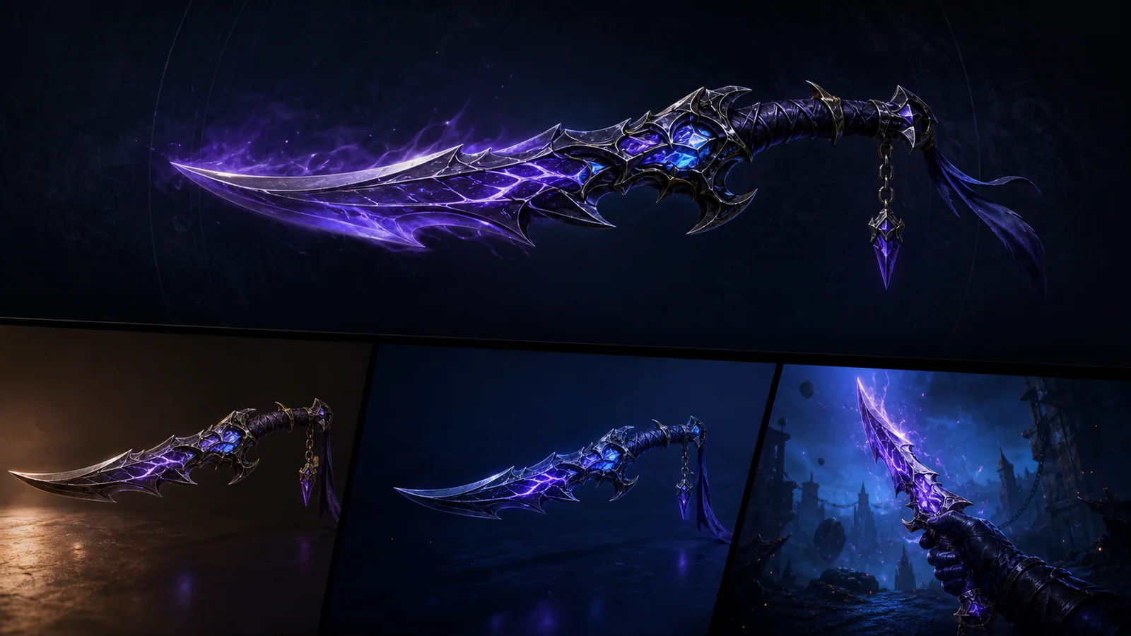
Cosmetic previews often use dark rooms, colored rim lights and constant camera motion. The presentation creates mood but can hide roughness, hue and small-scale readability. A useful preview separates evaluation from celebration.
Offer three lighting states
Begin with neutral studio light, then show a bright environment and a dark gameplay-like space. Keep camera angle and exposure comparable so players can identify real material changes.
Control the background
Provide a simple value slider or several representative maps. The skin should be tested against colors it is likely to encounter, not only against the backdrop that makes it look most expensive.
Animation, sound and dramatic light can follow in a showcase mode. The first responsibility is accurate understanding. A preview earns trust when the selected item looks familiar after the match begins, while still giving its art enough space to be appreciated.
Editorial note
Original interface and lighting analysis; no purchase recommendation.
- Kaizensclan Editorial Policy — editorial-policy.html
This article was reviewed on August 3, 2026.

Related stories

The One True King: Wraith King’s Arcana restores a throne
Valve released The One True King Wraith King Arcana through the 2020 Battle Pass at level 375. The cosmetic restores a skeletal king identity and rebuilds the.

Final Boss Veigar: an arcade villain with readable spells
Final Boss Veigar is a Legendary League of Legends skin built around the fantasy of a video-game end boss. Arcade colors, pixel motifs and a more theatrical.

VALORANT Ion: clean science fiction built around energy
Riot revealed the original VALORANT Ion skin line in November 2020. Its white shells, dark joints and blue energy cores present a clean science-fiction weapon.
Community channel
Join the discussion
Start a thoughtful, specific conversation about this story.
Verified readers only
Continue with Google to comment.
Your Google account creates a reader-only Kaizensclan profile. Your first comment is reviewed before publication.