Wear states work when damage follows the material story
A worn finish should explain where the object has been handled, struck and protected.

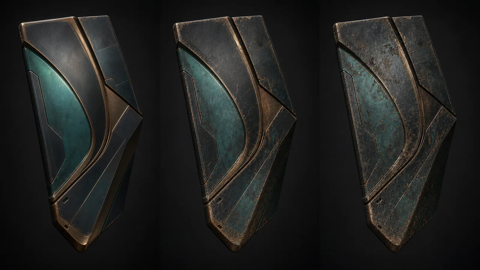
Wear can make a cosmetic feel personal, but random scratches rarely create a believable history. Convincing wear states follow material, construction and contact. Painted metal fails differently from polymer, cloth or polished stone, and each surface should reveal that difference.
Begin with contact zones
Grips, edges, moving parts and exposed corners receive repeated handling or impact. Wear should accumulate there before appearing across protected panels. This creates a readable hierarchy even at small scale.
Reveal a layer, not generic grey
Chipped paint should expose primer or metal; tarnish should respond to the underlying finish. The revealed layer can support the palette instead of merely desaturating it.
Preserve the identity at every state
Heavy wear may change detail, but the major value pattern and silhouette must remain recognisable. Compare this with muted palette design and CS2 finish readability.
A successful wear system offers different versions of the same object. It does not turn the final state into an unrelated texture.
Editorial note
Original material-design analysis; market value is outside scope.
- Counter-Strike 2 updates
- Kaizensclan Editorial Policy — editorial-policy.html
This article was reviewed on August 3, 2026.

Related stories
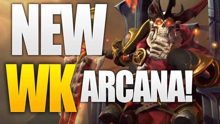
The One True King: Wraith King’s Arcana restores a throne
Valve released The One True King Wraith King Arcana through the 2020 Battle Pass at level 375. The cosmetic restores a skeletal king identity and rebuilds the.
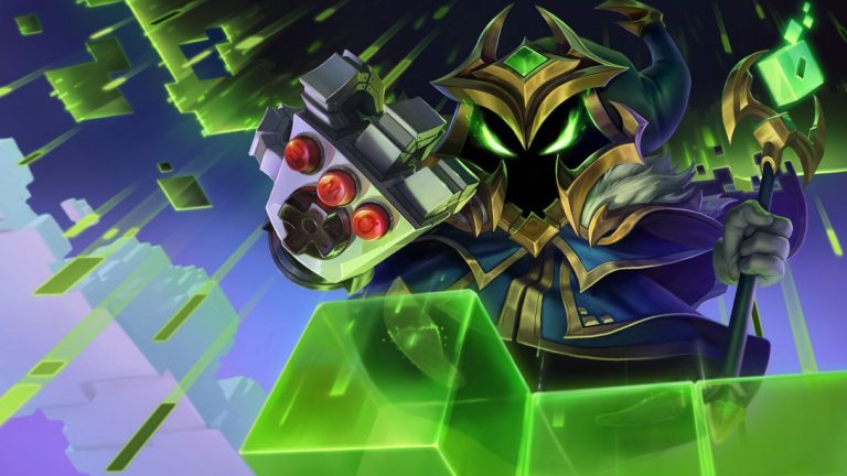
Final Boss Veigar: an arcade villain with readable spells
Final Boss Veigar is a Legendary League of Legends skin built around the fantasy of a video-game end boss. Arcade colors, pixel motifs and a more theatrical.
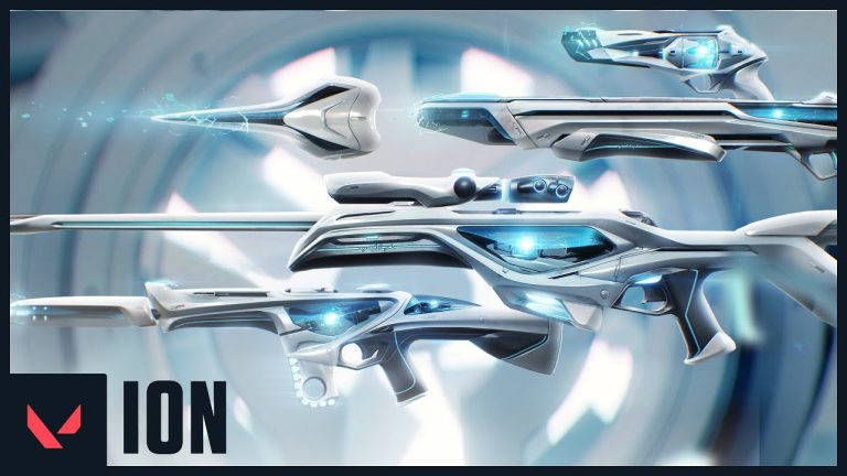
VALORANT Ion: clean science fiction built around energy
Riot revealed the original VALORANT Ion skin line in November 2020. Its white shells, dark joints and blue energy cores present a clean science-fiction weapon.
Community channel
Join the discussion
Start a thoughtful, specific conversation about this story.
Verified readers only
Continue with Google to comment.
Your Google account creates a reader-only Kaizensclan profile. Your first comment is reviewed before publication.