CS2 sticker placement: four crafts that preserve readability
Treat the weapon as a composition with landmarks, negative space and viewing distance.

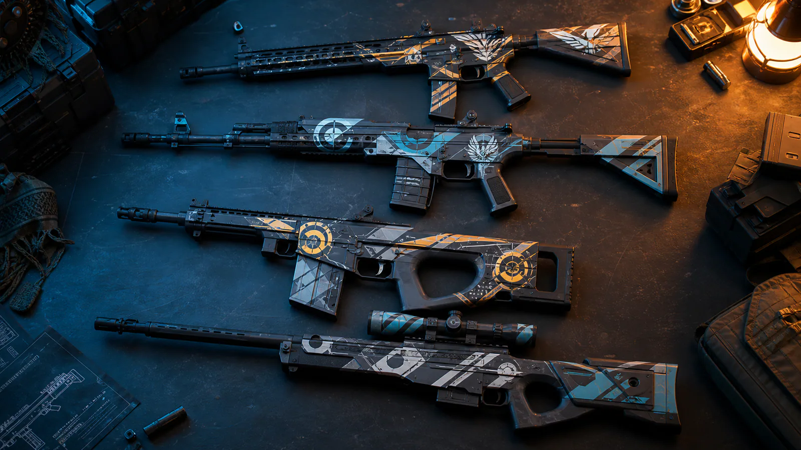
CS2 sticker placement can turn a familiar finish into a personal object, but more layers do not automatically produce a clearer craft. A sticker competes with the weapon silhouette, pattern and wear. The strongest arrangements add one readable idea while preserving the finish that made the base appealing.
The single landmark
Place one high-contrast sticker near a natural visual anchor such as the receiver, scope housing or broad rear panel. Leave the surrounding area quiet. This pattern works when the sticker has a strong silhouette and the base finish already contains enough detail.
Preview at normal gameplay distance. If the landmark disappears unless the weapon is inspected, its scale or value contrast may be too weak for the intended role.
The directional sequence
Use two or three related shapes to guide the eye along the weapon. Repeat colour or geometry while varying size. The sequence should follow the object’s length rather than cutting randomly across mechanical seams.
Keep one interval larger than the others to create rhythm. Perfectly even spacing can feel like inventory placement instead of a composed craft.
The framed contrast
Choose a sticker whose outer value separates it from the local finish and place it inside an existing panel. The weapon geometry becomes a frame. This is especially useful on complex patterns because it gives the sticker a stable boundary.
Avoid covering the only distinctive section of the finish. Our skin readability study shows how silhouette and large value zones carry recognition before fine detail.
The restrained set
Four related stickers can work when one leads and the others support it. Use condition, size, colour or placement to create that hierarchy. Four equally loud marks flatten the composition and hide both sticker and finish.
Photographic previews can mislead because inspection lighting and zoom reward micro-detail. Test the set in shade, bright map light and motion. Pair the result with principles from muted palette design: negative space is an active part of the craft.
Document the idea, not the price
A useful craft description explains why the placement works without turning market value into visual proof. Rarity may affect collectability, but it does not repair unclear composition. Record the finish, sticker names and placement only after the visual idea can be stated in one sentence.
The best CS2 sticker placement remains legible when the player is not trying to admire it. It respects the underlying finish, creates one hierarchy and gives the object a personal story without covering every available surface.
Editorial note
Visual-design analysis only; market prices and investment claims are excluded.
- Counter-Strike 2 updates
- Kaizensclan Editorial Policy — editorial-policy.html
This article was reviewed on July 31, 2026.

Related stories

The One True King: Wraith King’s Arcana restores a throne
Valve released The One True King Wraith King Arcana through the 2020 Battle Pass at level 375. The cosmetic restores a skeletal king identity and rebuilds the.
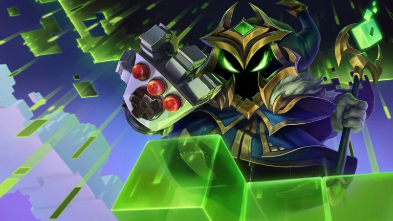
Final Boss Veigar: an arcade villain with readable spells
Final Boss Veigar is a Legendary League of Legends skin built around the fantasy of a video-game end boss. Arcade colors, pixel motifs and a more theatrical.

VALORANT Ion: clean science fiction built around energy
Riot revealed the original VALORANT Ion skin line in November 2020. Its white shells, dark joints and blue energy cores present a clean science-fiction weapon.
Community channel
Join the discussion
Start a thoughtful, specific conversation about this story.
Verified readers only
Continue with Google to comment.
Your Google account creates a reader-only Kaizensclan profile. Your first comment is reviewed before publication.