Rarity color systems should inform before they excite
The color is a shortcut, not the only place where value can be understood.

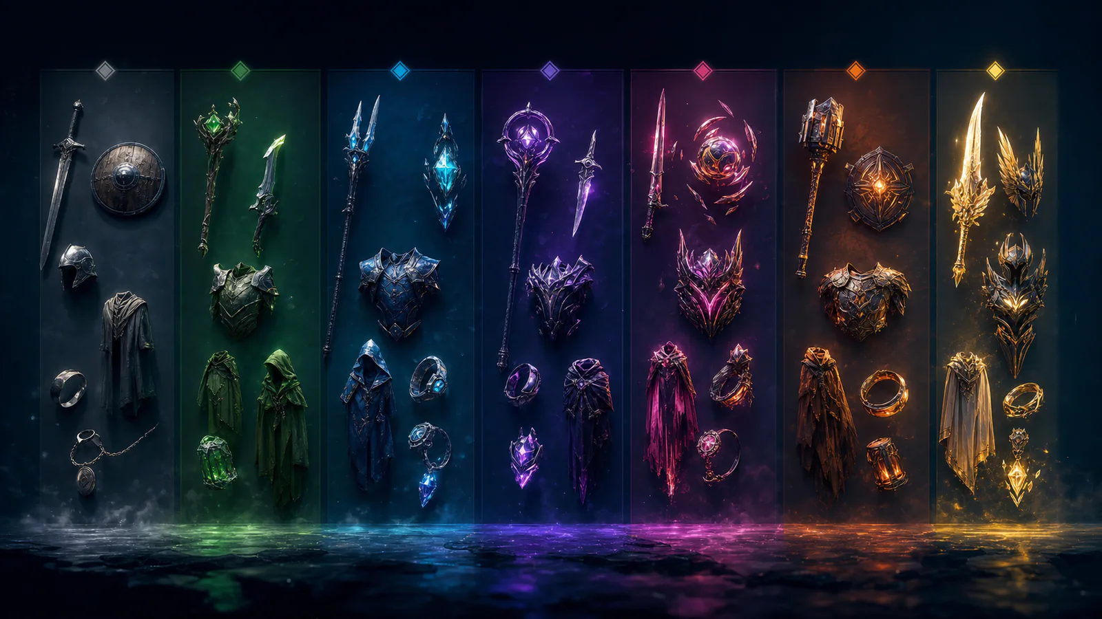
Rarity color is often treated as a progression from gray to increasingly saturated effects. That hierarchy can create excitement, but it fails when cards, text and lighting change the appearance or when users cannot distinguish adjacent hues.
Build redundant signals
Pair color with a label, border pattern or icon. The interface should remain understandable in grayscale and at small sizes. Reserve animation for the moments when rarity is being revealed, not every inventory view.
Control event palettes
Seasonal colors may collide with the established hierarchy. Test every campaign inside the full collection screen so a common event item does not resemble the highest tier by accident.
Rarity should help players scan ownership and comparison. When color becomes the entire value argument, the system encourages visual inflation. A stable hierarchy leaves room for individual skin art to be expressive without turning the interface into a competition for saturation.
Editorial note
Original interface-design analysis; no commercial ranking.
- Kaizensclan Editorial Policy — editorial-policy.html
This article was reviewed on August 3, 2026.

Related stories
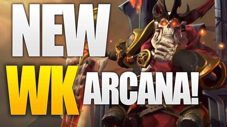
The One True King: Wraith King’s Arcana restores a throne
Valve released The One True King Wraith King Arcana through the 2020 Battle Pass at level 375. The cosmetic restores a skeletal king identity and rebuilds the.
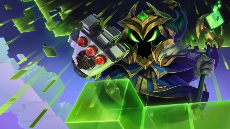
Final Boss Veigar: an arcade villain with readable spells
Final Boss Veigar is a Legendary League of Legends skin built around the fantasy of a video-game end boss. Arcade colors, pixel motifs and a more theatrical.
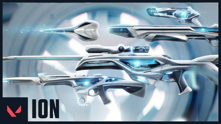
VALORANT Ion: clean science fiction built around energy
Riot revealed the original VALORANT Ion skin line in November 2020. Its white shells, dark joints and blue energy cores present a clean science-fiction weapon.
Community channel
Join the discussion
Start a thoughtful, specific conversation about this story.
Verified readers only
Continue with Google to comment.
Your Google account creates a reader-only Kaizensclan profile. Your first comment is reviewed before publication.