Why muted skin palettes survive longer than neon trends
When every surface demands attention, the object loses its visual hierarchy.

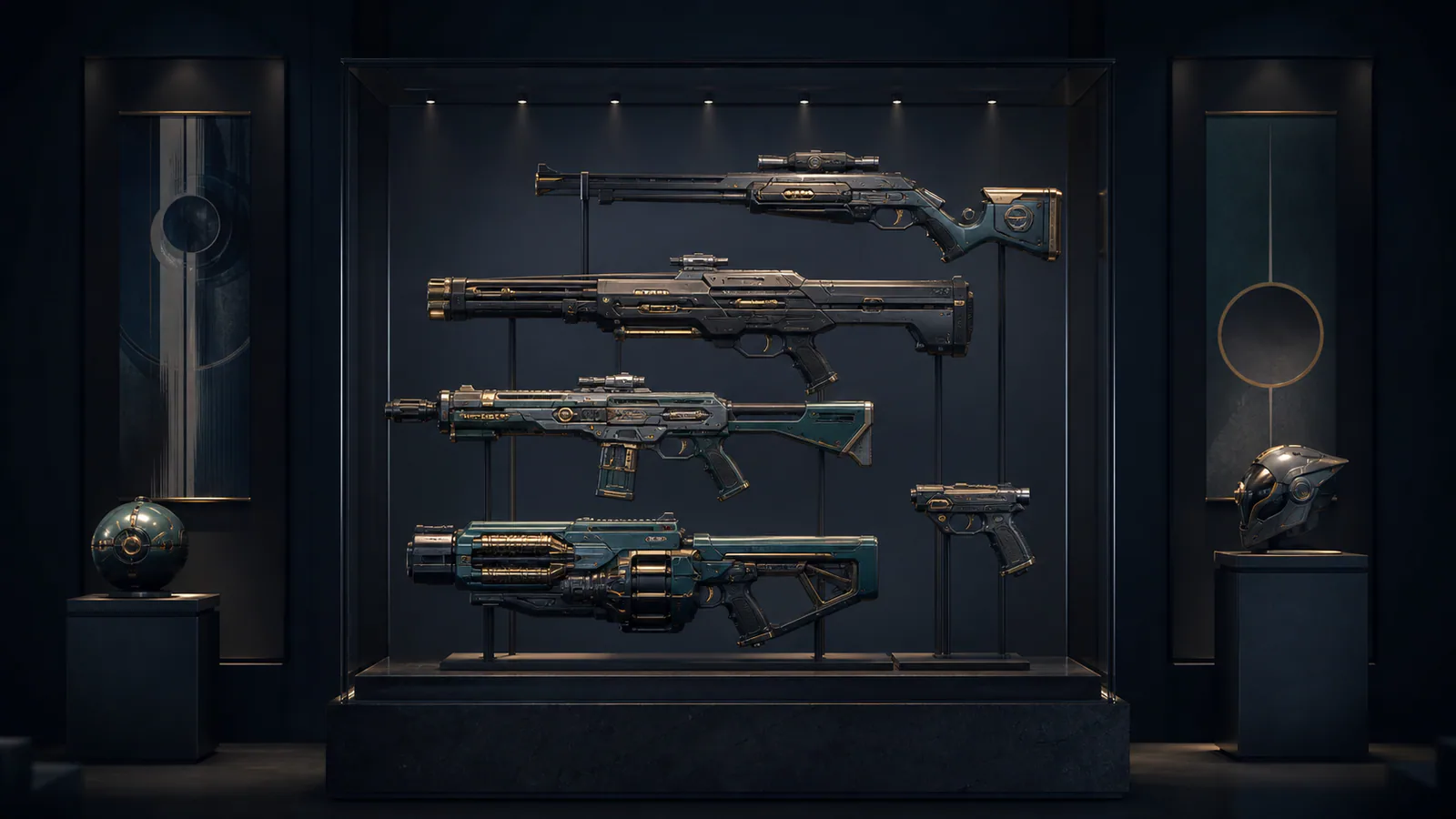
Bright colour is an efficient way to make a game skin visible in a store thumbnail. It is not the only way to make the design memorable after hundreds of matches. Muted skin palettes often age better because they force material, silhouette and contrast to carry the identity. Restraint gives the eye a route through the object instead of asking every surface to compete.
Muted does not mean low contrast
A restrained palette can contain sharp value differences. Charcoal beside brushed silver, worn bronze beside deep blue or a single pale accent on black can read clearly at gameplay distance. What disappears is not contrast but unnecessary colour competition.
Designers can reserve the brightest value for one functional landmark: the receiver, magazine, blade edge or animated core. That landmark remains recognisable during movement because surrounding surfaces support it.
Material becomes part of the colour
When saturation is lower, roughness, reflection and wear have more room to speak. The same grey can read as polymer, painted steel or stone depending on how it catches light. Those differences give a cosmetic depth without adding another hue.
Material-led design also adapts better across maps. A surface that relies on controlled highlights can remain legible under warm, cool and neutral lighting. This relationship between visibility and finish appears throughout our CS2 skin readability analysis.
Restraint protects animation
Reload and inspect animation create temporary focal points. If the resting object already flashes everywhere, motion has little visual emphasis left to claim. A muted base lets a moving chamber, pulse or small colour change feel intentional.
Our reload animation hierarchy explores that sequence in detail. The central principle is the same: attention needs somewhere quiet to begin.
A palette can age with the player
Novelty is powerful during a reveal, while ownership is repetitive. Cosmetics seen for months benefit from details that reveal themselves slowly: a subtle edge colour, a different finish under shadow or wear that frames the grip. Muted designs can move from spectacle toward familiarity without becoming visual noise.
This does not make neon palettes inferior. High saturation can express arcade energy, fantasy power or a specific event identity. The stronger question is whether the palette supports the object’s hierarchy. A lasting skin knows which surface speaks first, which answers second and which remains quiet.
Editorial note
Original visual-design analysis; no purchase recommendation or market pricing.
- Kaizensclan Editorial Policy — editorial-policy.html
This article was reviewed on July 31, 2026.

Related stories
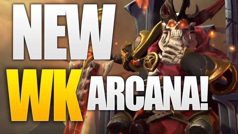
The One True King: Wraith King’s Arcana restores a throne
Valve released The One True King Wraith King Arcana through the 2020 Battle Pass at level 375. The cosmetic restores a skeletal king identity and rebuilds the.
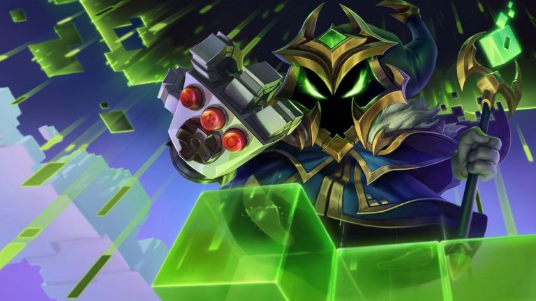
Final Boss Veigar: an arcade villain with readable spells
Final Boss Veigar is a Legendary League of Legends skin built around the fantasy of a video-game end boss. Arcade colors, pixel motifs and a more theatrical.
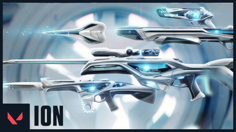
VALORANT Ion: clean science fiction built around energy
Riot revealed the original VALORANT Ion skin line in November 2020. Its white shells, dark joints and blue energy cores present a clean science-fiction weapon.
Community channel
Join the discussion
Start a thoughtful, specific conversation about this story.
Verified readers only
Continue with Google to comment.
Your Google account creates a reader-only Kaizensclan profile. Your first comment is reviewed before publication.