Collection interfaces should help players compare, not scroll
The collection screen is an editorial system for objects the player already owns.

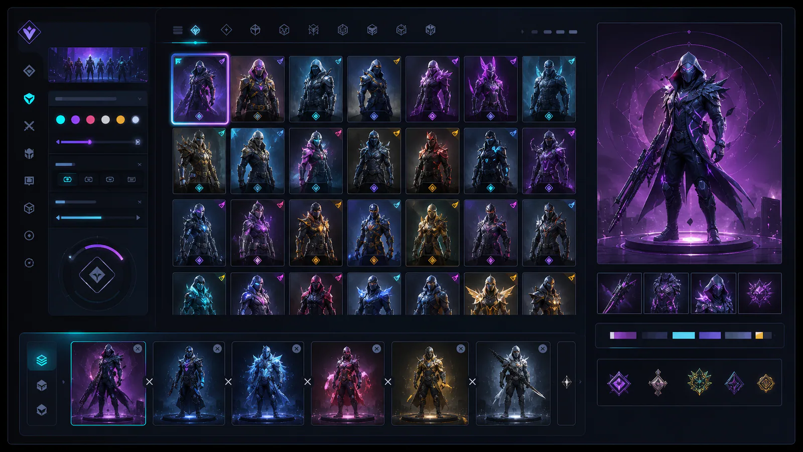
Cosmetic collections grow faster than the interfaces used to browse them. A large grid proves quantity, but it does not help players compare finishes, remember favourites or assemble a coherent loadout. A useful collection interface treats browsing as a sequence of decisions.
Filter by visual property
Game, weapon and rarity are useful administrative filters. Players also need colour family, material, animation intensity and event origin. Visual properties connect the interface to the reason a cosmetic was chosen.
Keep comparison in place
Opening two items in separate screens forces memory to perform the comparison. A tray should preserve selected items, align viewing angles and expose the same metadata. The goal is not a marketplace table but a clear visual decision.
Remember context
Save recent filters, favourites and loadout relationships. Event history can connect to cosmetics as souvenirs, while colour filters can use the hierarchy described in muted palettes.
A collection interface succeeds when the player can answer “why this one?” without scrolling past everything else they own.
Editorial note
Original interface-design analysis; no commercial ranking.
- Kaizensclan Editorial Policy — editorial-policy.html
This article was reviewed on August 3, 2026.

Related stories

The One True King: Wraith King’s Arcana restores a throne
Valve released The One True King Wraith King Arcana through the 2020 Battle Pass at level 375. The cosmetic restores a skeletal king identity and rebuilds the.
Final Boss Veigar: an arcade villain with readable spells
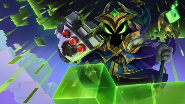
Final Boss Veigar is a Legendary League of Legends skin built around the fantasy of a video-game end boss. Arcade colors, pixel motifs and a more theatrical.
VALORANT Ion: clean science fiction built around energy
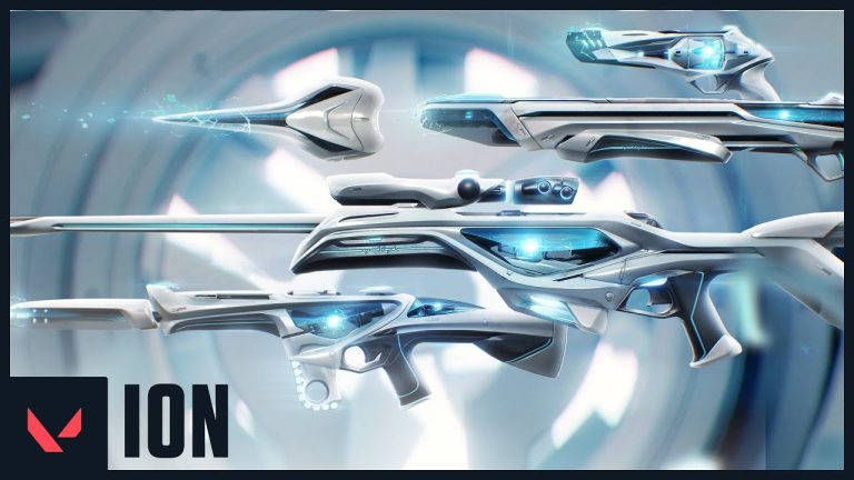
Riot revealed the original VALORANT Ion skin line in November 2020. Its white shells, dark joints and blue energy cores present a clean science-fiction weapon.
Community channel
Join the discussion
Start a thoughtful, specific conversation about this story.
Verified readers only
Continue with Google to comment.
Your Google account creates a reader-only Kaizensclan profile. Your first comment is reviewed before publication.