Battle pass skins need a collection idea, not one repeated texture
A collection should feel related without making every reward look like a recolor.

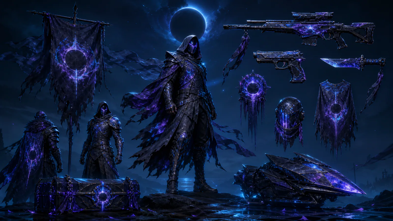
Seasonal collections often chase coherence by applying one pattern to every item. That produces immediate unity and little discovery. Strong battle pass art defines a visual grammar—perhaps a shape language, material contrast or recurring signal—then lets each object interpret it differently.
Choose three shared rules
Define one palette relationship, one construction motif and one effect behavior. No item needs all three at equal strength. The variation creates hierarchy while preserving the family.
Design across the reward path
Place quieter interpretations early and reserve the most complete transformation for the final tier. Small rewards such as charms or cards should extend the idea rather than imitate the hero item at reduced scale.
Review the complete pass as a loadout. If combining rewards produces visual noise, the rules are too broad. Coherence should help players remember a season and assemble combinations after it ends.
Editorial note
Original collection-design analysis; no purchase recommendation.
- Kaizensclan Editorial Policy — editorial-policy.html
This article was reviewed on August 3, 2026.

Related stories
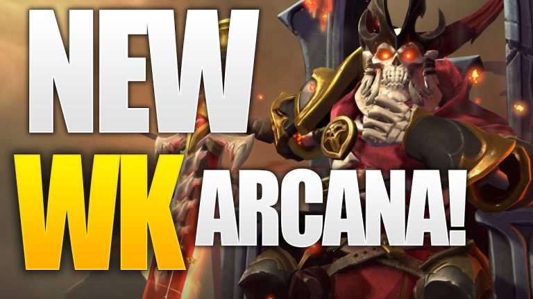
The One True King: Wraith King’s Arcana restores a throne
Valve released The One True King Wraith King Arcana through the 2020 Battle Pass at level 375. The cosmetic restores a skeletal king identity and rebuilds the.
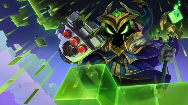
Final Boss Veigar: an arcade villain with readable spells
Final Boss Veigar is a Legendary League of Legends skin built around the fantasy of a video-game end boss. Arcade colors, pixel motifs and a more theatrical.
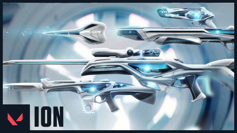
VALORANT Ion: clean science fiction built around energy
Riot revealed the original VALORANT Ion skin line in November 2020. Its white shells, dark joints and blue energy cores present a clean science-fiction weapon.
Community channel
Join the discussion
Start a thoughtful, specific conversation about this story.
Verified readers only
Continue with Google to comment.
Your Google account creates a reader-only Kaizensclan profile. Your first comment is reviewed before publication.