CS2 Graphic Collection ranked by visual clarity
Our CS2 Graphic Collection ranking compares all 16 print-inspired finishes by silhouette, colour structure, weapon fit and first-person gameplay clarity.

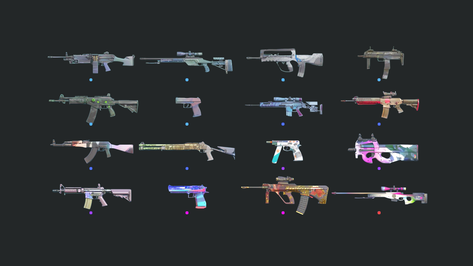
The CS2 Graphic Collection turns print production into a weapon-skin system. Halftone dots, registration errors, colour bars and editorial shapes appear across 16 finishes, but the best designs translate those ideas into the proportions of a specific gun.
Valve introduced the collection with The Armory update on October 2, 2024. This ranking evaluates visual clarity, concept and weapon fit. It deliberately excludes price movement, rarity value and investment speculation.
1. AWP | CMYK
CMYK earns first place by making the AWP’s long body feel like a print test pulled through a machine. Cyan, magenta, yellow and black are not merely bright colours; their separation is the subject of the finish.
Large white areas keep the rifle readable and give the colour room to register. The design remains distinctive in first person without covering every panel in equal detail.
2. AUG | Lil’ Pig
Lil’ Pig uses illustration with better discipline than its name suggests. The character creates an immediate focal point, while the surrounding shapes preserve the AUG’s unusual silhouette.
It is playful, memorable and easy to identify. The finish also demonstrates that a graphic-design theme can include a mascot without abandoning layout and composition.
3. Desert Eagle | Starcade
Starcade combines saturated arcade colour with the Desert Eagle’s large flat side. The pistol gives the artwork a compact poster-like canvas, and the finish responds with strong blocks rather than tiny texture.
Its brightness is controlled by darker framing. That contrast helps the slide remain legible against both pale and shadowed map surfaces.
4. M4A4 | Polysoup
Polysoup is deliberately strange, but its geometric fragments align with the M4A4’s separate components. The colour changes feel structural instead of sprayed randomly across the rifle.
The result has movement without sacrificing the outline. It is one of the collection’s best examples of abstract art serving weapon form.
5. AK-47 | Crossfade
Crossfade uses gradient and panel contrast to modernize the AK without hiding its wooden-rifle heritage under a dense illustration. It is calmer than the top four and likely easier to use across long sessions.
The finish proves that the collection’s print theme does not require visible dots on every surface. Transition itself can be the graphic device.
The strongest supporting finishes
CZ75-Auto | Slalom and P90 | Attack Vector turn directional marks into speed. Their lines suit weapons associated with rapid, close-range engagements, although the P90’s broad body carries the concept more clearly.
XM1014 | Halftone Shift, FAMAS | Halftone Wash and P2000 | Coral Halftone explore dot patterns at different scales. Halftone Shift has the clearest sense of movement; Coral Halftone offers the cleanest colour block.
SSG 08 | Halftone Whorl and M249 | Spectrogram stretch technical graphics over longer bodies. Both communicate the collection immediately, but neither has the simple focal point of CMYK.
Quiet designs still have a purpose
Galil AR | NV, SCAR-20 | Wild Berry, SG 553 | Berry Gel Coat and MP7 | Astrolabe occupy the less theatrical end. Their restrained surfaces can support cohesive loadouts and sticker placement even when they do not dominate a screenshot.
That utility is easy to underestimate. A skin seen for hundreds of rounds benefits from stable colour zones and a recognizable outline. Our finish-readability analysis explains why contrast at normal play distance matters more than inspection-screen detail.
What makes the collection coherent
The Graphic Collection does not repeat one pattern across 16 weapons. It repeats a production vocabulary: dots, plates, gradients, misregistration, diagrams and bold editorial colour. Each finish selects part of that vocabulary.
This gives the group variety without making it arbitrary. AWP | CMYK and AUG | Lil’ Pig look very different, yet both resemble objects created inside the same experimental print studio.
Final ranking verdict
AWP | CMYK is the most complete translation of theme into weapon. Lil’ Pig, Starcade and Polysoup follow because their focal points remain clear in first person. Crossfade rounds out the top five as the best restrained choice.
Players building crafts may prefer the quieter lower-tier finishes, where open panels leave space for stickers. Our CS2 champion-sticker report shows that trade-off in practice. Design rank is not a buying recommendation, and market prices can change independently of visual quality.
Sources: Valve’s The Armory update, October 2, 2024; collection image credited to Skinport.
Editorial note
Facts and mechanics were checked against the linked primary sources before publication.
This article was reviewed on August 6, 2026.

Related stories
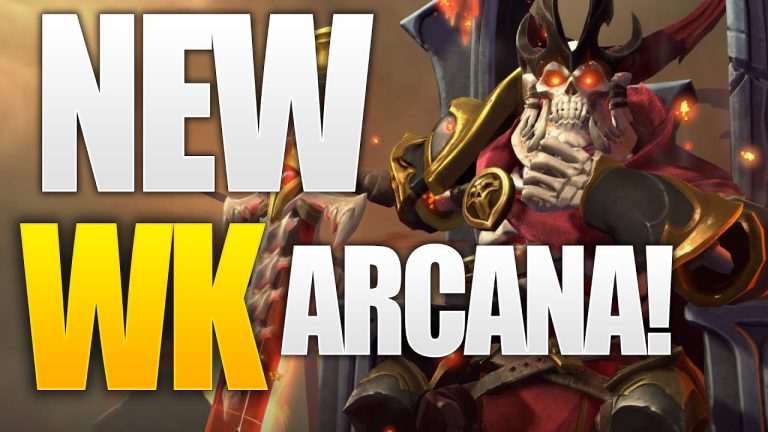
The One True King: Wraith King’s Arcana restores a throne
Valve released The One True King Wraith King Arcana through the 2020 Battle Pass at level 375. The cosmetic restores a skeletal king identity and rebuilds the.
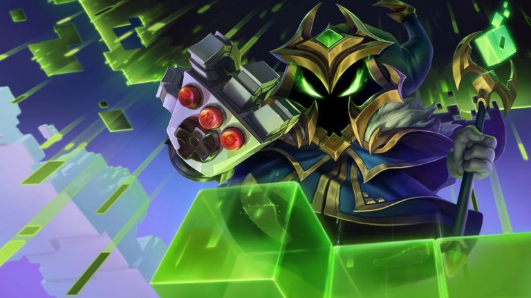
Final Boss Veigar: an arcade villain with readable spells
Final Boss Veigar is a Legendary League of Legends skin built around the fantasy of a video-game end boss. Arcade colors, pixel motifs and a more theatrical.
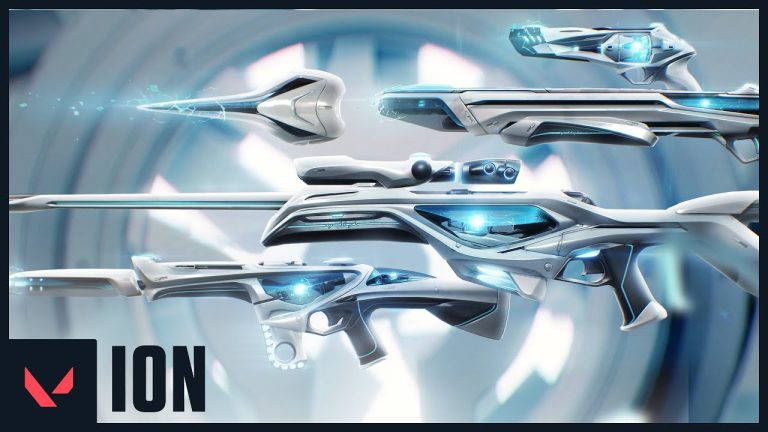
VALORANT Ion: clean science fiction built around energy
Riot revealed the original VALORANT Ion skin line in November 2020. Its white shells, dark joints and blue energy cores present a clean science-fiction weapon.
Community channel
Join the discussion
Start a thoughtful, specific conversation about this story.
Verified readers only
Continue with Google to comment.
Your Google account creates a reader-only Kaizensclan profile. Your first comment is reviewed before publication.