CS2 skin readability: six finishes that stay clear
Six finish approaches ranked by silhouette, materials and normal play—not price.

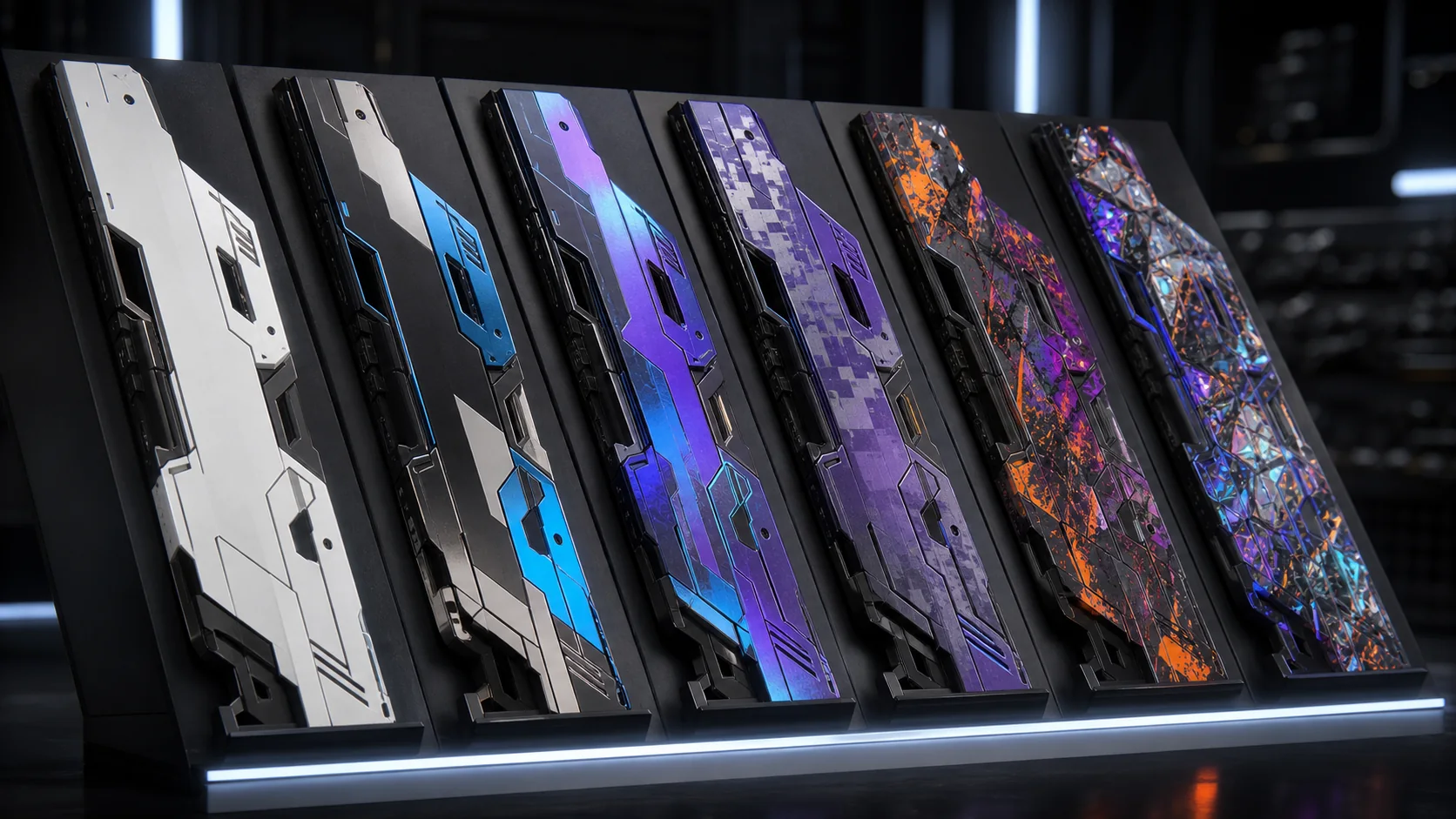
CS2 skin readability is easy to ignore in a static inspection view and impossible to miss during a tense round. We rank six finish approaches by silhouette, material separation and how well the design survives movement—not by rarity or market price.
Our ranking method
We judge the first-person read at three distances: inventory close-up, normal weapon position and a small spectator thumbnail. A strong finish keeps its main idea in all three. Fine detail can reward inspection, but it should not be responsible for the entire identity.
This is editorial design analysis, not a buying guide. Prices change, rarity does not guarantee clarity and no cosmetic improves weapon performance.
1. High-contrast blocking
Large light and dark regions follow the receiver, magazine and stock instead of fighting them. The finish remains legible in shadow and does not need animated effects. It is the most durable approach because the weapon’s construction becomes part of the graphic.
The risk is sterility. One controlled accent near a natural focal point gives the design a signature without turning every surface into a billboard.
2. Directional gradient
A gradient works when it reinforces length and balance. Moving from cool to warm along the weapon creates an immediate orientation cue and gives rare pattern variation room to exist without breaking the whole.
Gradients lose clarity when each component changes direction independently. The eye reads separate stickers rather than one finish.
3. Material contrast
Pairing matte polymer with glossy enamel creates hierarchy through light, not only colour. It looks different as the view moves and can remain restrained in a screenshot. The strongest versions use gloss on protected visual landmarks instead of every exposed edge.
4–6. Pattern, holographic film and visual noise
Repeating patterns can work when their scale respects the model. Holographic film adds movement but often overwhelms painted structure under bright map lighting. At the bottom of our ranking, full-surface noise removes the silhouette and makes wear harder to read.
Complexity is not automatically bad. It needs a quiet region that lets the eye reset. Without that pause, premium effects become a flat shimmer.
What to inspect before judging a finish
- Check it in bright and dark environments.
- View the normal held position, not only the inspect animation.
- Look at wear around the largest colour boundary.
- Reduce the image to thumbnail size.
- Compare the design with stickers hidden and visible.
For a broader framework, read our cosmetic silhouette ranking and analysis of sound and animation. Valve’s official updates remain the source for changes to finish and sticker rendering.
Sources and update note
Official Counter-Strike 2 update notes
This article was manually reviewed on July 27, 2026. Generated editorial artwork is credited to Kaizensclan.
Editorial note
- Kaizensclan editorial visual analysis
This article was reviewed on July 27, 2026.

Related stories

The One True King: Wraith King’s Arcana restores a throne
Valve released The One True King Wraith King Arcana through the 2020 Battle Pass at level 375. The cosmetic restores a skeletal king identity and rebuilds the.
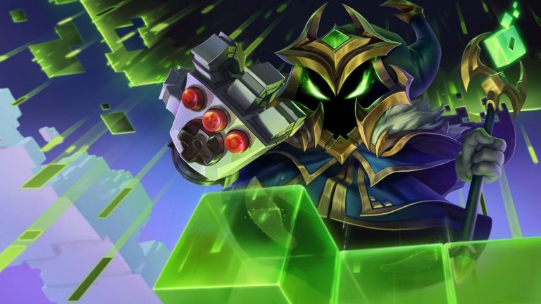
Final Boss Veigar: an arcade villain with readable spells
Final Boss Veigar is a Legendary League of Legends skin built around the fantasy of a video-game end boss. Arcade colors, pixel motifs and a more theatrical.

VALORANT Ion: clean science fiction built around energy
Riot revealed the original VALORANT Ion skin line in November 2020. Its white shells, dark joints and blue energy cores present a clean science-fiction weapon.
Community channel
Join the discussion
Start a thoughtful, specific conversation about this story.
Verified readers only
Continue with Google to comment.
Your Google account creates a reader-only Kaizensclan profile. Your first comment is reviewed before publication.