AWP The Prince: ornament shaped by negative space
The AWP The Prince design balances red lacquer, dark metal and gold filigree across one of Counter-Strike's longest models. Released in The Canals Collection,.

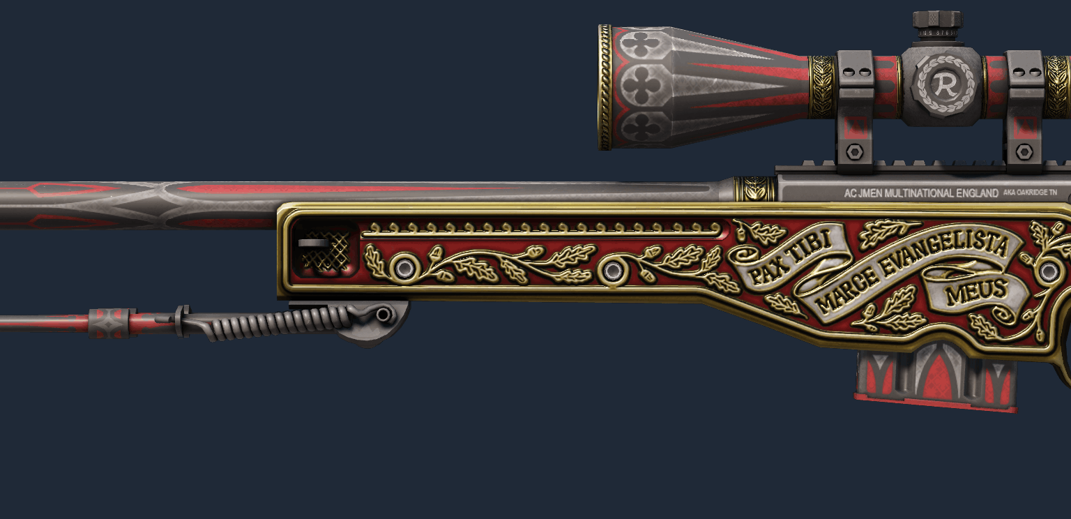
The AWP The Prince design balances red lacquer, dark metal and gold filigree across one of Counter-Strike’s longest models. Released in The Canals Collection, the Covert finish creates prestige through spacing: ornament is concentrated where the rifle offers broad panels and reduced near the sight line.
AWP The Prince design: visual language
The red stock acts as negative space around repeated gold curves. Rather than covering every component, the artwork uses borders and directional flourishes that echo a manuscript frame. Black scope hardware separates the decorated body from the player’s aim, while small pale accents stop the gold-red palette becoming muddy.
Animation and audio
The standard AWP inspection exposes the finish in sections. Rotation first presents the receiver and stock, then lets highlights travel over gold details. There is no custom sound or animation; the visual change comes from the contrast between flat red areas and reflective ornament as the rifle moves.
Readability during play
The Prince remains identifiable at reduced size because the dominant red body and gold border form one large signal. The black scope and barrel preserve essential silhouette breaks. Fine lines reward close inspection but are not required for recognition, which is why the finish works both in first person and in broadcast pickups.
Production context
Valve released The Prince as part of The Canals Collection. Its classification, wear range and individual market listings should be checked at the time of purchase. This design study does not treat scarcity as proof of artistic quality and does not imply any competitive benefit.
Why the design lasts
The finish endures because it understands visual hierarchy. A red field establishes identity, gold lines provide craft and black hardware protects function. The result feels ornate without becoming a wallpaper pattern, demonstrating how deliberate empty space can make decoration look richer.
This article evaluates cosmetic craft and documented history rather than market value. Availability and prices can change, and no cosmetic provides a mechanical advantage.
Sources: primary release notes or official records. Factual claims were checked against these records; interpretation is our own.
Continue with the Kaizensclan archive, our practical guides and the latest game reviews.
Editorial note
Facts and mechanics were checked against the linked primary sources before publication.
This article was reviewed on August 14, 2026.

Related stories
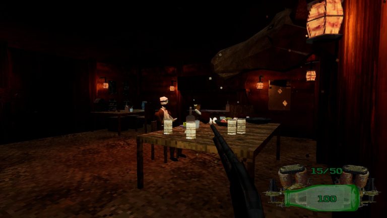
The Down Below opens four underground horror levels
The Down Below opens four underground horror levels. lowpolyenjoyer combines a lever-action shotgun, nine enemy types, 30 interactive items, physics props…

Deep Diver makes every breath increase the danger
Deep Diver makes every breath increase the danger. PEGAX Studios connects oxygen management to escalating enemies across eight weapons, 30 abilities and…
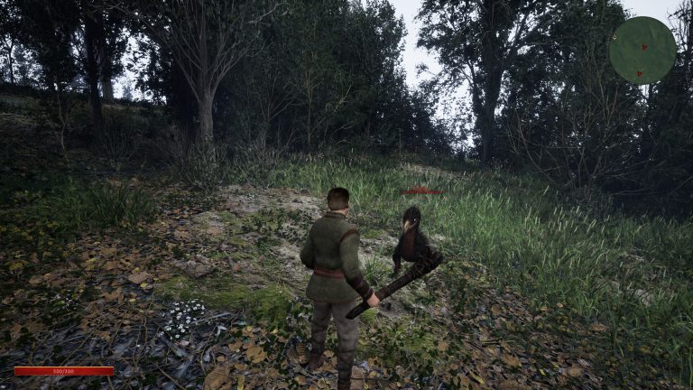
Ashes of Kardoria launches a 16-hour faction RPG
Ashes of Kardoria launches a 16-hour faction RPG. The choice-driven campaign pits Guards against Hunters amid plague and hunger, with multiple endings and…
Community channel
Join the discussion
Start a thoughtful, specific conversation about this story.
Verified readers only
Continue with Google to comment.
Your Google account creates a reader-only Kaizensclan profile. Your first comment is reviewed before publication.