VALORANT Oni Design Retrospective
A VALORANT Oni retrospective examining Japanese-inspired masks, layered materials, supernatural animation, audio feedback and weapon readability. Read the.

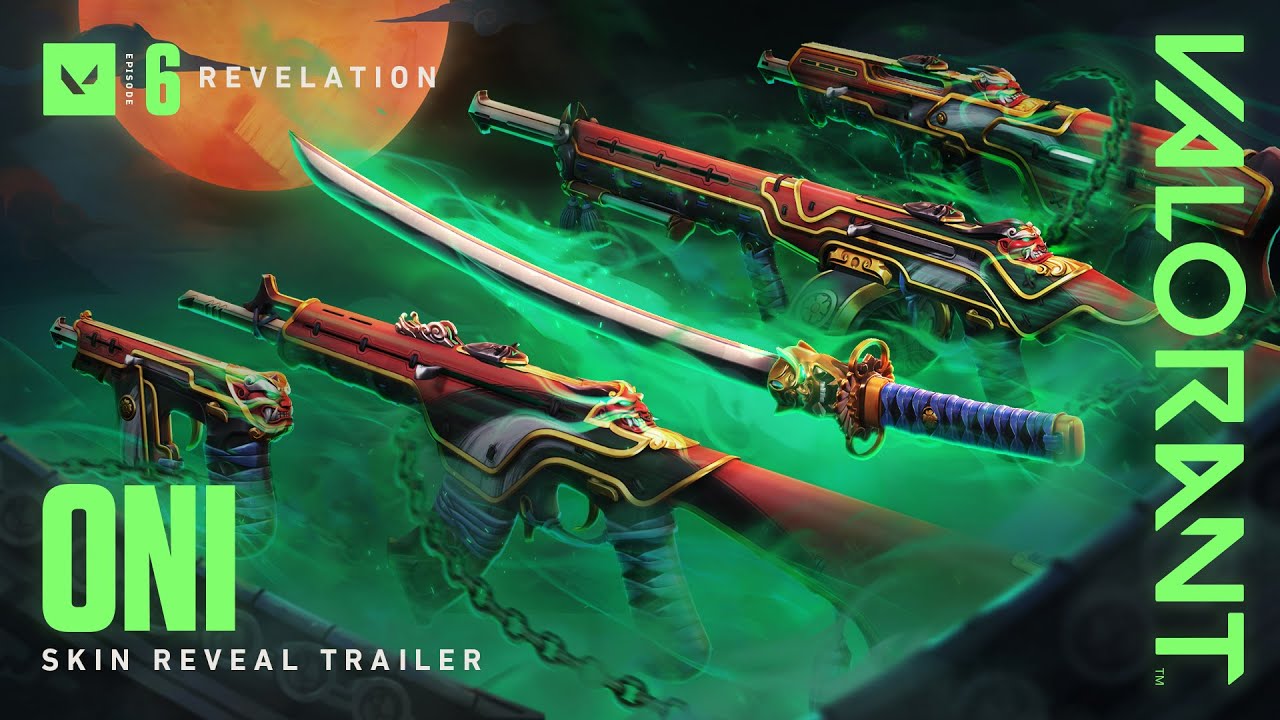
Oni translates masks, rope, lacquered surfaces and supernatural corruption into a VALORANT weapon family. Its appeal comes from tension between crafted ceremonial objects and something alive behind them. The weapons feel haunted without abandoning the proportions players use to identify them.
Visual identity
The mask is a focal symbol rather than a texture repeated without control. Curved plates, cord and carved details create material contrast around it, while quieter surfaces preserve the receiver and barrel. Colour variants reinterpret the same object as different forms of armour or spirit instead of changing the design’s grammar.
Animation and sound language
Animation suggests contained presence. Energy breathes through the model, the finisher expands the demon imagery, and Onimaru Kunitsuna gives the second collection a melee piece with deliberate unsheathing weight. Weapon audio adds a darker body to shots but retains enough attack to communicate fire rate and hit rhythm.
Readability in a live match
Oni is ornate, yet the brightest effects stay attached to the weapon instead of filling the screen during ordinary aiming. The muzzle, sight line and reload state remain visible. The mask can draw attention at inspection distance, but it does not replace the functional silhouette in the centre of a fight.
Design context
The original Oni collection established the theme on weapons including the Phantom, while the later return extended it to the Vandal and a katana-style melee. That expansion worked because it reused principles rather than identical shapes. A different rifle could belong to the same mythology without looking like a resized Phantom shell.
Why the design lasted
Oni remains memorable because every layer supports one emotional idea: beauty shaped around dangerous spirit. The design is culturally legible without relying on a single colour, and its finisher feels like the conclusion of the existing theme. Cohesion, more than raw particle count, gives the line durability.
This is a design retrospective, not financial advice or a claim about current store availability. Cosmetic prices, rotations and market listings can change; the analysis concerns the released art, animation and presentation.
Source: official release information.
Read more in our practical guides and browse the Kaizensclan article archive.
Editorial note
Facts and mechanics were checked against the linked primary sources before publication.
This article was reviewed on August 7, 2026.

Related stories
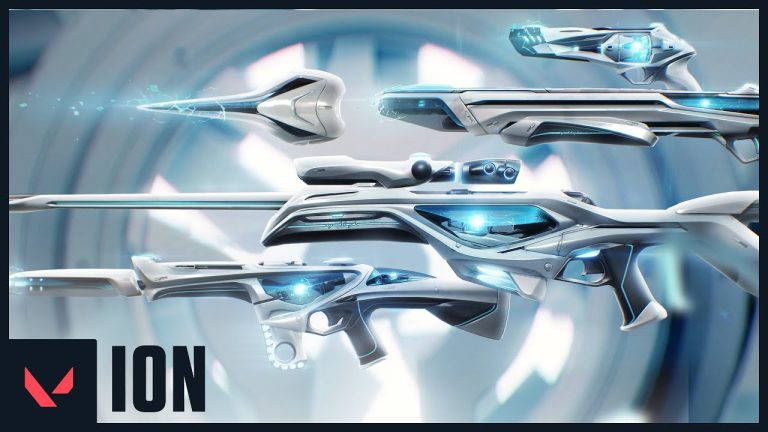
VALORANT Ion: clean science fiction built around energy
Riot revealed the original VALORANT Ion skin line in November 2020. Its white shells, dark joints and blue energy cores present a clean science-fiction weapon.
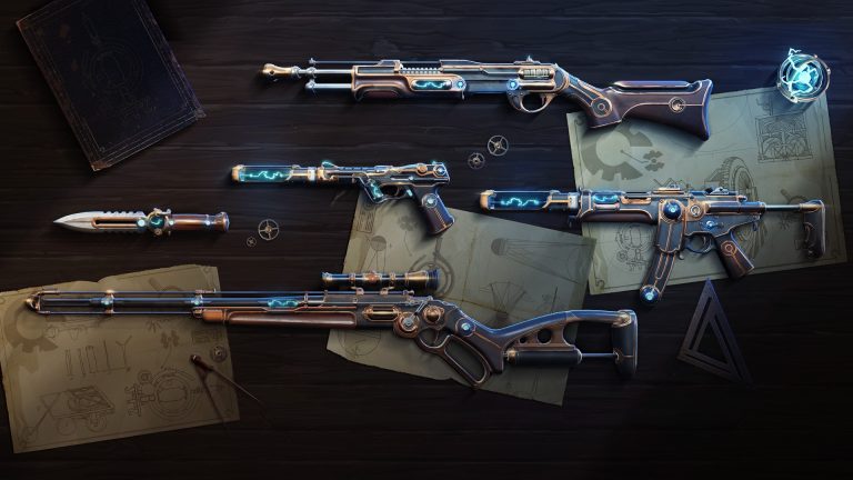
VALORANT Magepunk: electricity inside an old machine
VALORANT Magepunk first appeared in 2021 with Ghost, Spectre, Bucky, Marshal and Electroblade cosmetics, then expanded through later collections. The line.
VALORANT Bind A execute guide for patch 13.02
A reliable Bind A execute creates two simultaneous problems instead of sending five players through A Short. Control either Showers or the Short cubbies, cut.
Community channel
Join the discussion
Start a thoughtful, specific conversation about this story.
Verified readers only
Continue with Google to comment.
Your Google account creates a reader-only Kaizensclan profile. Your first comment is reviewed before publication.