Skin material contrast: make metal, polymer and cloth disagree
A premium object needs surfaces that react differently to the same light.


Many skins assign different colors to panels while every surface reflects light in the same way. The result reads as one printed shell. Material contrast gives the object physical hierarchy: metal holds a sharp edge, polymer spreads highlights and cloth absorbs them.
Separate response before palette
Test the skin in neutral gray lighting. Adjust roughness, microtexture and edge wear until the materials remain distinct without color. This prevents a dramatic showroom light from hiding weak construction.
Use transitions as evidence
Seams, fasteners and exposed layers should explain how parts meet. Wear belongs where contact and movement occur, not evenly across every panel.
Finally, return the color palette and test at gameplay distance. Material contrast should support the major value pattern rather than create noisy detail. The object feels premium when each surface appears to have been manufactured, handled and illuminated for a reason.
Editorial note
Original visual-design analysis; no purchase recommendation.
- Kaizensclan Editorial Policy — editorial-policy.html
This article was reviewed on August 3, 2026.

Related stories
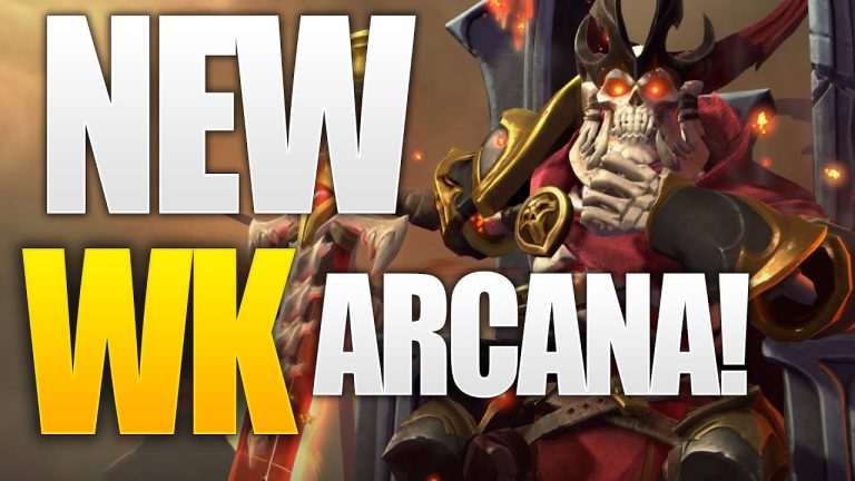
The One True King: Wraith King’s Arcana restores a throne
Valve released The One True King Wraith King Arcana through the 2020 Battle Pass at level 375. The cosmetic restores a skeletal king identity and rebuilds the.
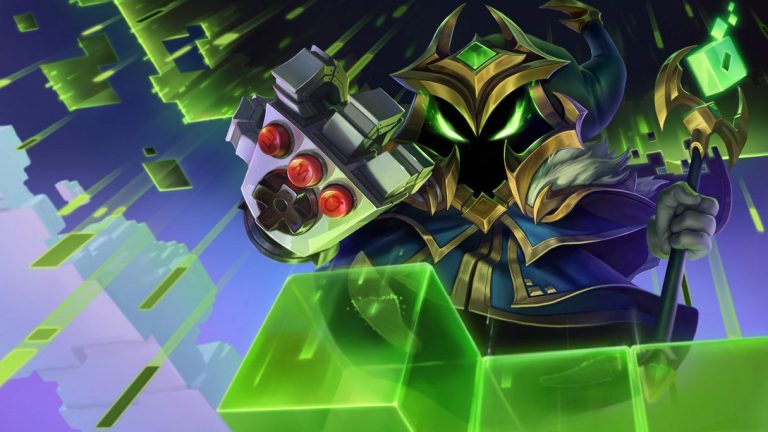
Final Boss Veigar: an arcade villain with readable spells
Final Boss Veigar is a Legendary League of Legends skin built around the fantasy of a video-game end boss. Arcade colors, pixel motifs and a more theatrical.

VALORANT Ion: clean science fiction built around energy
Riot revealed the original VALORANT Ion skin line in November 2020. Its white shells, dark joints and blue energy cores present a clean science-fiction weapon.
Community channel
Join the discussion
Start a thoughtful, specific conversation about this story.
Verified readers only
Continue with Google to comment.
Your Google account creates a reader-only Kaizensclan profile. Your first comment is reviewed before publication.